PLATFORM
iOS/ Android/ Web
TIMELINE
Sept 2018 - Mar 2019
WHAT IS SAVED ITEMS?
This feature enables LinkedIn members to find all their saved items like learning videos, posts, jobs etc. in a centralized place and track the latest related to them. This feature is a part of LinkedIn member’s profile.
ROLE
I was the sole Product Designer on this feature, reporting to my manager for design feedback. I drove alignment with designers and PM’s across LinkedIn’s 5 different teams to design the Saved items framework. I worked closely with engineering team on handoff and design polish. I also presented this feature to design leadership.
BUSINESS GOAL
Improve engagement of saved items across LinkedIn
A member can discover a plethora of things like courses, jobs, articles on LinkedIn and save them for later engagement. Each of these items have their unique workflows across different contexts across the LinkedIn product. The re-discovery rate for these items was significantly low, thereby resulting in low engagement. Additionally, “saving” was recognized as one of the important success metric that indicates the discovered items are relevant to users’s search intent, and its continued engagement contributing to company wide metrics like daily active users.
MEMBER PROBLEM
Help members find success for discovered opportunities
A LinkedIn member can access various items like courses, articles, jobs etc. on the platform and save them to their profile. Each of these items have unique workflows like tracking job applications, or progress on watched courses. One of the biggest pain point that LinkedIn members experienced was that there was no easy way to track these workflows. There was a strong need to streamline the rediscovery workflows and help members find success for discovered opportunities by being able to access, engage with them.
THE SOLUTION
A holistic framework to house different saved items
Across the different saved items use cases (jobs, courses, articles, projects etc) there were common pain points related to being able to access, track and organize these items. There was a brainstorm session between different teams across LinkedIn, involving designers, PM’s and researchers from Jobs, Learning, Talent Solutions and Marketing Solutions team to understand the overall vision of the project and and begin to establish an aligned POV on the information architecture for this project.
After sharing respective products user goals, we broke into smaller teams to brainstorm possible solutions and then converged to distill them into considerations as follows -
A list of lists
Each team’s exploratory IA revolved around a high level organization. That is, shortcuts to more detailed steps within the workflow.
Serve the urgent need
The notion of time-sensitive arose across each team. This idea prioritizes, highlights or surfaces workflows that require time-sensitive actions by the member as a top priority.
Workflow connectivity
Most workflows are not done in isolation, but multiple workflows can be connected towards a larger goal. My items provides this opportunity to bring them together in conjunction.
Display what’s relevant
Information wise display what’s relevant and just enough for member to establish context about the state of an item.
As a result there was a need for a framework that is consistent, familiar and scalable across different LinkedIn items. This was an opportunity for all LinkedIn products across LinkedIn Talent Solutions, Feed, Jobs (both business and consumer) to come together and live under a member’s profile for quick access. This feature required me to build a solid understanding of every product’s lifecycle and their respective discovery points across LinkedIn. This is the final framework for the My items platform that I designed, considering organic and global entry points for different items across LinkedIn.
The Framework
Global entry point
Based on common consensus and direction from Product leadership, I decided to leverage the existing “Saved items” entry point on Profile to serve as the global access to My items.
I worked with Content design and also did a company wide survey to decide on the name of this product. Initially the project was names “Workflow tracker” but due to the negative connotation associated with “tracking my profile”, we landed on my items.
Support linear flows
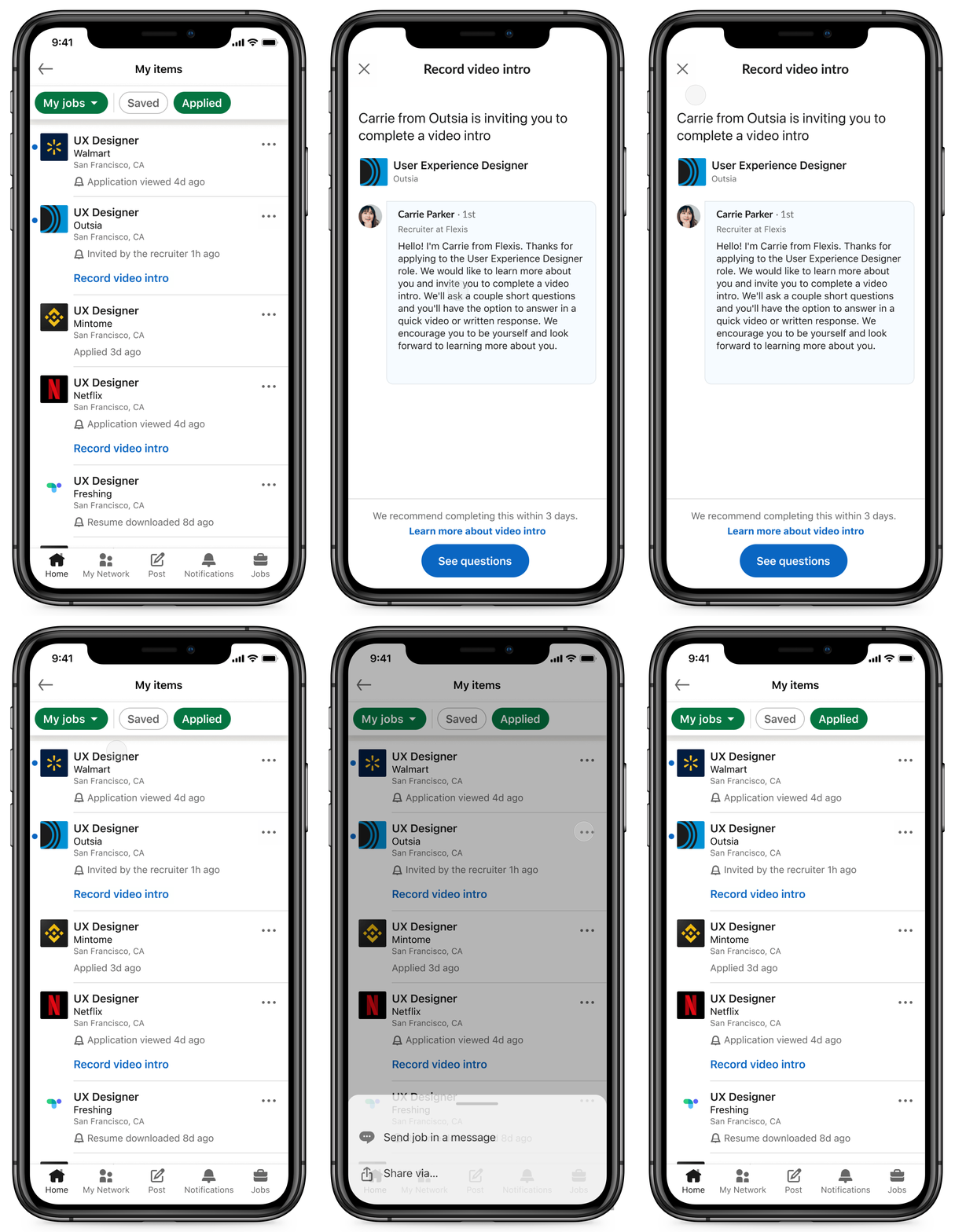
Every use case list page would contain multiple cards, each representing a saved item. A member can see minimal information that’s just enough to understand that item’s current state. Supporting linear flows meant allowing members to dive deeper into a specific item’s details.
I leveraged the industry and LinkedIn wide pattern of exposing abstracted information to represent multiple items and “Tap to see more” interaction to take users to every item’s detail page.
Support non-linear flows
I leveraged the existing mental modal of LinkedIn users that exist today on Home feed, jobs - tap on an overflow icon to see more actions related to any object like jobs, articles.
This way every type of item can serve specific actions relevant to it’s current state and lifecycle.
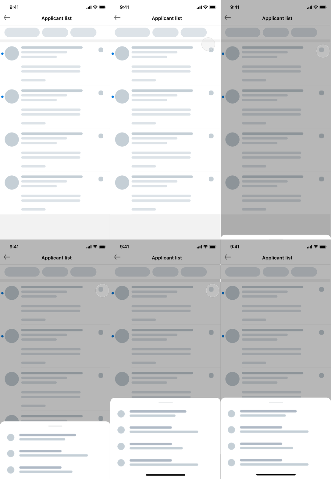
I chose bottom sheet as a UI to surface the different actions because it was the most scalable way to quickly surface entry points into multiple sub-tasks, while keeping the user in their existing context.
Bottom sheet to expose different actions that takes user out of My items and into a specific, focussed workflow.
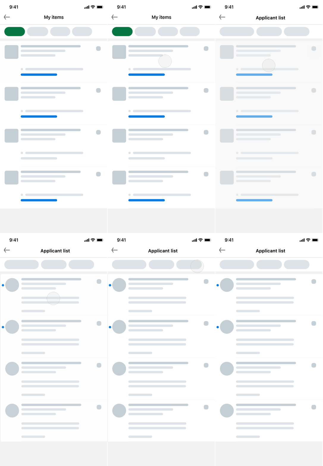
New updates based on workflow
Three was feedback from users across multiple use cases (applied jobs, posted jobs, projects) about missing out on time sensitive updates related to their items.
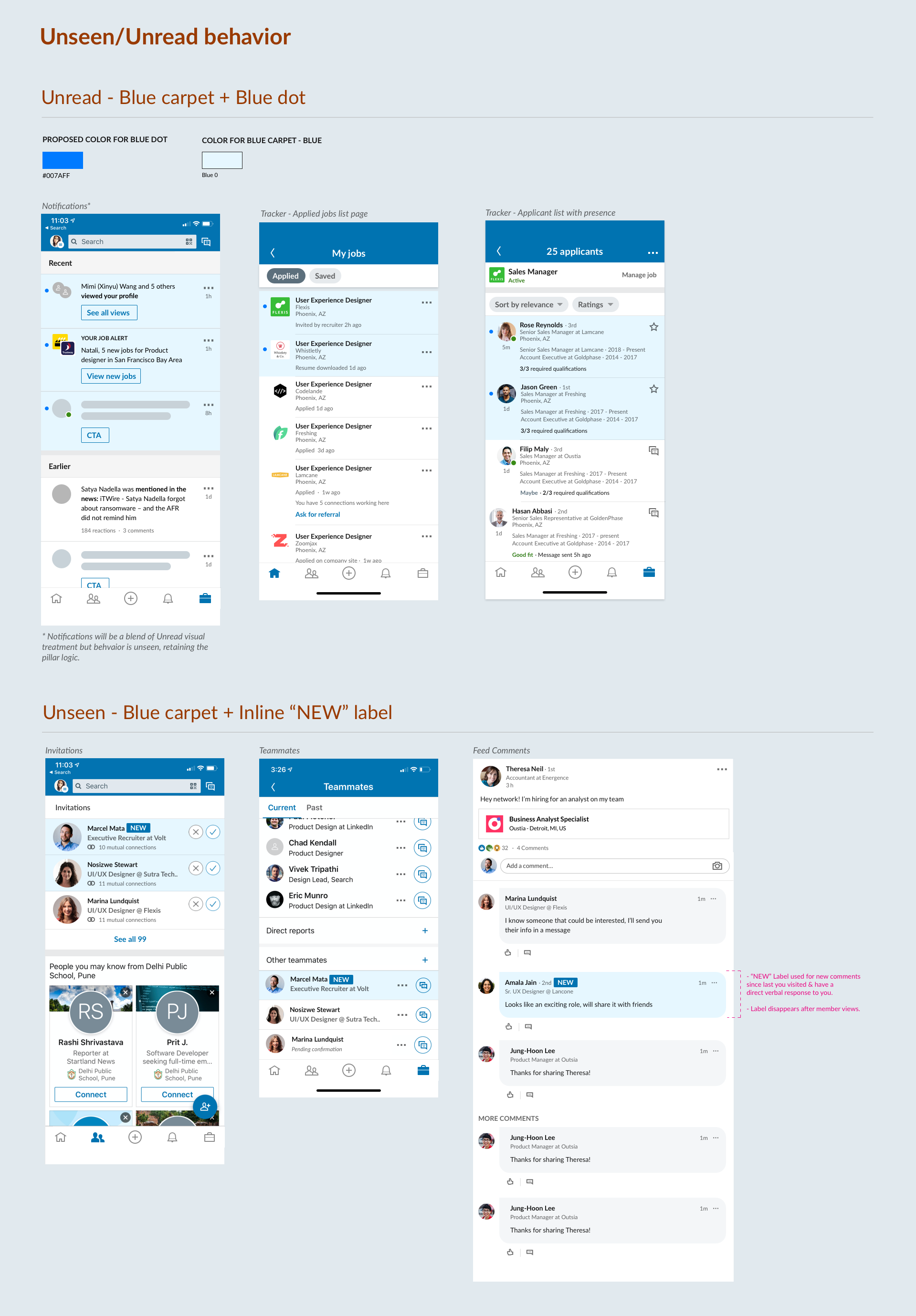
To address this need I decided to leverage LinkedIn’s notifications pattern that highlights any unread item when there’s a new update associated with it. The blue background and dot appear are meant to draw users’ attention and is cleared only after they tap on it to see the details, thereby signaling the acknowledgement.
Information architecture wise the “unread” item UI trickles down to sub-lists, until there’s no new information visible to the user. I improved the existing “unread” UI to a new, accessible “unread” pattern which was then adopted across the app’s surfaces like Notifications, Messaging etc.
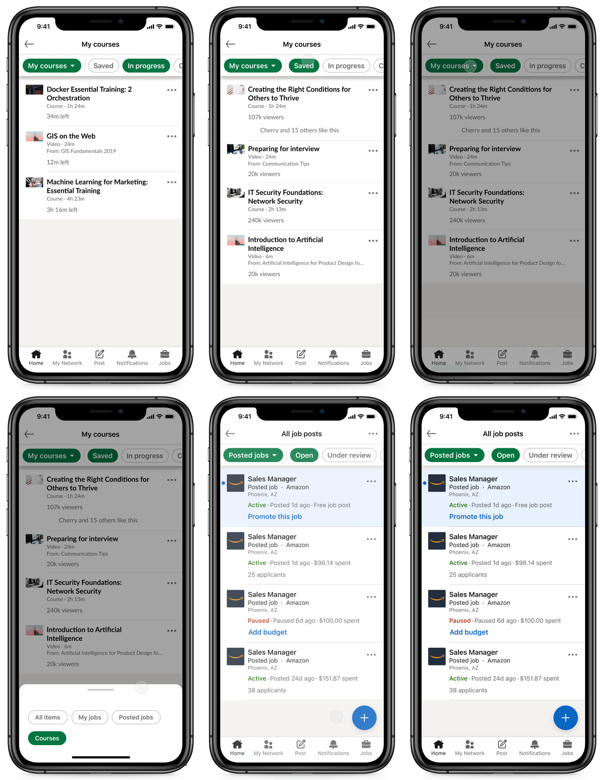
Filters for organization
For every use case there was a need to organize items in different subcategories based on their current workflow state. Additionally, we wanted to design for a hypothesis that a user can be in different “modes” and would want to jump between different items like jobs, courses.
In order to facilitate quick context switching and clear categorization of items I leveraged the filter framework from LinedIn’s Search UI, typically used to filter and switch between different results.
Provide valuable signals
Abstracting the right level of information for every item card, and for every workflow state was the most challenging part of this project. I worked with every use case’s PM and designer to define what these signals are and how to best represent them for every flavor of an item.
From a framework perspective, my goal was to leverage visual consistency to enable quick scanning of these individual items not just on a single use case page across use cases. These “signals” allow members to establish a quick context of an items status.
The CHALLENGES
Negotiating with other designers and PM’s
I had the opportunity to work with designers and PM’s from other products - which meant that every product team evangelized how their product was important. They rightfully felt the need to expose more signals and guidance on their item card. While launching the jobs use case, we spent a lot of time on iterating the “perfect” amount of information with respect to buttons and guidance and signal information.
My project’s PM and manager were my best ally’s during this time and pushed me to go for an escalation decision, where the product leadership made the final decision on the UI. It was during this time that the design and product principles that I had framed with my PM helped me present the logical thinking behind my proposal. I was able to use consistency as a strong driving factor for the final decision.
The Final Experience
My items on mobile
CONTRIBUTING TO THE DESIGN SYSTEM
An accessible design pattern for “unread” items
I designed a new, accessible, unread pattern for My items which was adopted across the entire LinkedIn product ecosystem and is live today.
The blue “carpet” or background was the initial pattern that was being used on LinkedIn for denoting unread items like messages, notifications, comments etc. I needed a way to denote “unread items” on the My items pages in order to draw attention to things that needed immediate attention. From a design leadership presentation, I received feedback that this pattern was not accessible. Accessibility is considered table stakes for any project at LinkedIn, so as a part of this project, I started working on a new pattern for LinkedIn. I started with a competitive analysis to understand what is the industry pattern and can be leveraged on the app and desktop site.
This project started by delineating “unread” with “unseen”. The blue carpet pattern was used for representing both these states. I started by doing an entire audit of all the use cases across Flagship that use these pattern and then dived into solution for representing both the “unread” and “unseen” state. The mocks above are from LinkedIn’s old design system.
After multiple iterations and office hours rounds with the consumer app, accessibility and design system team, the blue dot and carpet together were finalized as the new pattern. I also tested the new solution for different settings so stress-test the accessibility of my proposed solution and shared it with the design leadership time to get buy-in.
This way I was able to contribute to a design pattern that got adopted across the LinkedIn product ecosystem.
Designing for web
We took the mobile-first approach for this project. I picked up the designs for desktop after designing the mobile experience. My items has contextual as well as two global entry points on the web experience. Members can access it via the homepage left rail, under their profile card, as well as from their profile page, similar to the mobile experience.
The page layout and design patterns for LinkedIn’s website are different that the native apps. The biggest challenge was figuring out a page layout that could scale for navigation, main content, supplemental actions depending on the use case and all of this while maintain feature parity with the mobile app designs.
I adopted the left-rail navigation pattern from the linkedin.com’s home screen to switch between use cases. For filtering within the use cases, I added in-page filters in the main rail. The rightmost rail was used for any supplemental actions/advertising, being contextual to the use case that the member is on.
DESIGN DELIVERABLES
Documenting and socializing designs
I created an internal share-point website for My items for future products/use cases to onboard. This website was referred by different product teams and also the engineering team to understand the high-level details like the framework and also small details related to the item cards.
I also made a list of design and product principles in collaboration with my PM partner in order to drive consistency and familiarity for any use cases that onboard in the future.
PROJECT OUTCOME
Fast adoption and high engagement
We onboarded 5 use-cases on My items including Jobs, LTS, articles, learning and Service Marketplace. After launching these ucescases incrementally, we saw that around 45.5% members were re-engaging with their saved items. This validated the hypothesis that members are most likely in multiple modes while using LinkedIn
MY LEARNINGS
Key takeaways
Stick to design principles but bring empathy.
Defining design and product principles helped me lay down a strong foundation for consistency. There were times when I had to move away from these to serve member needs on a use case
A process-oriented approach takes you a long way.
Having a weekly check-in cadence with my design partners and the engineering team helped me stay updated on product goals across different verticals and design with consistency.
It’s easy to forget discussions so document everything.
Working on a platform meant decisions happening during 1:1 conversations with multiple design/product partners. Having a design decision sheet to log these helped convey and trace them.


