PLATFORM
iOS, Android and Web
WHAT IS CONTENT SEARCH
When a LinkedIn member searches for posts with topical keywords, the results experience that they see is “Content Search”. LinkedIn’s Content Search was using dated layouts for surfacing matching posts from Feed. The existing experience only had 5% of engagement rate and was not optimized for fast browsing.
TIMELINE
Jan 2020 - May 2021
ROLE
I was the sole Product Designer, ideating and testing different concepts for the re-imagined experience. I drove alignment with LinkedIn’s Feed team and design leadership on the finalized solution. I also worked closely with engineering on handoff and design QA.
BUSINESS OPPORTUNITY
Low share and growth contribution (5%) by content search towards the site-wide engagement
Search results page is one of the “top of funnel” surface across LinkedIn’s platforms, where members can discover different types of content, people, jobs and engage with them. Search contributed actions is a metric that tracks this engagement for every kind of result. There was a significant gap in contributions of the search originated actions for content i.e. articles compared to the overall site wide actions. Hence there was a strong push from leadership to explore this opportunity. LinkedIn’s goal that year was also to empower content creators and pushing for engaging content experience was an important goal.
MEMBER PROBLEM
High barrier to contribution and difficult to find relevant content search results
In addition to measured low engagement rate of 5% for content search results, we also gathered some qualitative feedback from an in-product, feedback tool about the existing content search experience as follows -
Old experience with content cards inherited from LinkedIn’s Feed pillar
TARGET USER GROUPS
Going back to the basics
Before diving into work, it was important to revisit who our target users were and their needs on the platform specifically. In addition to end users, we also had an in-house Editorial team that heavily leveraged the content search experience to research LinkedIn’s News section on the platform. My PM set up a meeting with the editorial team to observe their workflows and gather any detailed feedback about the current experience. Using this as the input, I came up with two types of target user groups for whom we were going to design the experience -
design tenets
Design principles for guidance
After going through the qualitative feedback, distilling the user needs and auditing the pain points of the existing experience, next step was a FigJam session with my Product Manager to come up with design principles that were going to guide us in the decision making process. I also shared these with Search’s Product leadership during a design critique session to gather any feedback and ensure we were aligned on the common goal.
Encourage exploration
Enable seamless browsing & exploration between multiple posts.
Scannable
Enable smooth context switching from list view vs detail view, considering varying levels of information density.
Show relevancy signals
Show sufficient context of a post and its match to the member's query to signal its quality.
Reduce contribution friction
Make it easy for members to contribute (react, comment, share) to conversations.
APPROACH
Remote design sprint to ideate, test and inform product direction
We planned a design sprint to invite multiple stakeholders from different teams within LinkedIn as there were some dependencies and a huge opportunity to learn from one another. We had designers, PM’s, researchers join us from LinkedIn’s Feed, Jobs and Editorial team and share crucial insight about member behavior, design patterns and upcoming related projects on their respective pillars. This helped our design sprint participants get a primer on what behavior can be leveraged and brainstorm solution ideas. We used a voting system to prioritize ideas that I would then take to explore in detail with mocks.
There were multiple iterations and long review sessions that happened with Search’s product and design leadership team to finalize some options that we would want to test. This sprint’s outcome was to test, learn and inform the direction for LinkedIn’s Search experience.
Voting on brainstormed design ideas
MOBILE EXPERIeNCE
Bottom sheet interface to see post details
Bottom sheet is the most versatile mobile UI pattern that can be leveraged to surface any kind of supplemental information. I chose to use this to surface additional post details because it retains the context of search results and addresses member pain point to be able to to switch back and forth between post cards and details.
After auditing the different types of posts on LinkedIn, I came up with the skeleton contents of a bottom sheet as follows -
Actor information
Body text
Media (image, video, 3rd party articles, embedded post, polls )
Engagement information (likes and comments count)
Comment bar
Comments
Building edges by discovering new hashtags to follow
During the execution phase of the sprint, I came up with 5 different concepts, each with variations of actor, content and action bar placement. I also identified that there’s an opportunity for content explorers to dive deeper into related topics by surfacing discovery of hashtags. I presented the following options to Search’s product and design leadership team for feedback on design direction.
For user testing, we decided to move ahead with Option 1 because UI wise it resembled the feed content experience the most, leveraging member’s existing mental model. Additionally, from engineering perspective, we wanted to leverage existing code to minimize the level of effort.
DESIGN DETAILS
Perfecting the mobile experience
Diving deeper into designs, I worked on defining the engagement interactions such as like, comment and sharing posts on the bottom sheet surface. I was going to test the following concepts from a usability perspective.
An immersive and scalable bottom sheet
I designed the anatomy of the bottom sheet to ensure it scaled to fit +6 variations of embedded objects. The information hierarchy was to always lead with the Actor lockup and edge creation action, followed by the actor commentary, embedded object (dynamic), actions bar and then towards the end, commentary.
During the design of the sheet, I aligned with LinkedIn’s Feed design team on this layout to maintain consistency for how content is consumed on LinkedIn.
Motion design to convey affordance
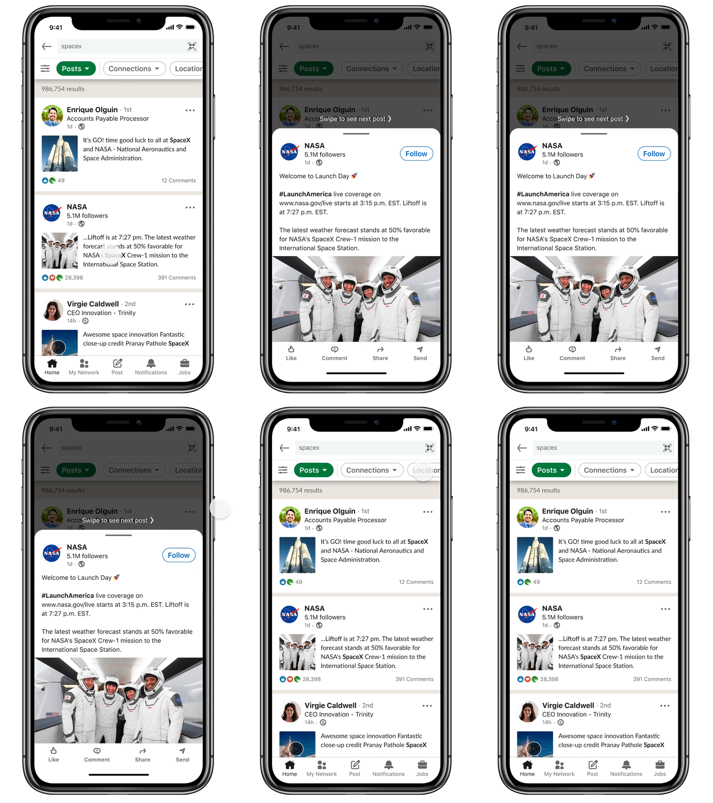
In order to enable users to traverse between posts in the detail view, I added the ability to swipe to see more posts. To make this discoverable, I thought of two ways to do it -
Using motion that gives user a sneak peek of the next post
An overlay text that explicitly guides users to swipe to see
Scroll to see post details
From all the explorations, I decided to keep the action bar sticky at the bottom and have rest of the post detail scrollable. This way the bottom sheet can scale up to fit any amount of text content along with embedded media.
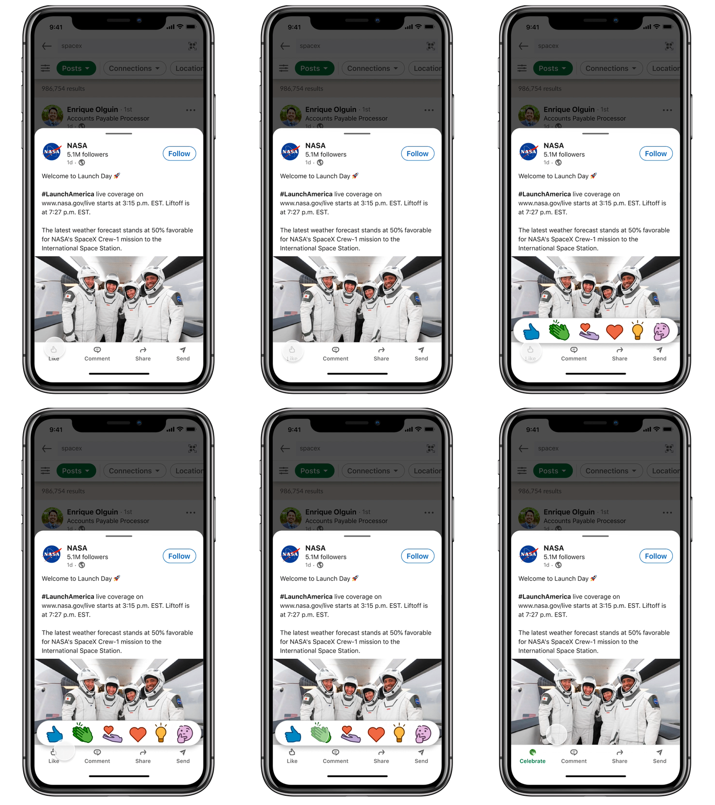
Sticky action bar for easy discoverability
I decided to keep the action bar consisting of like, comment, share and send together sticky so members can easily discover them, thereby encourage them to engage with the content.
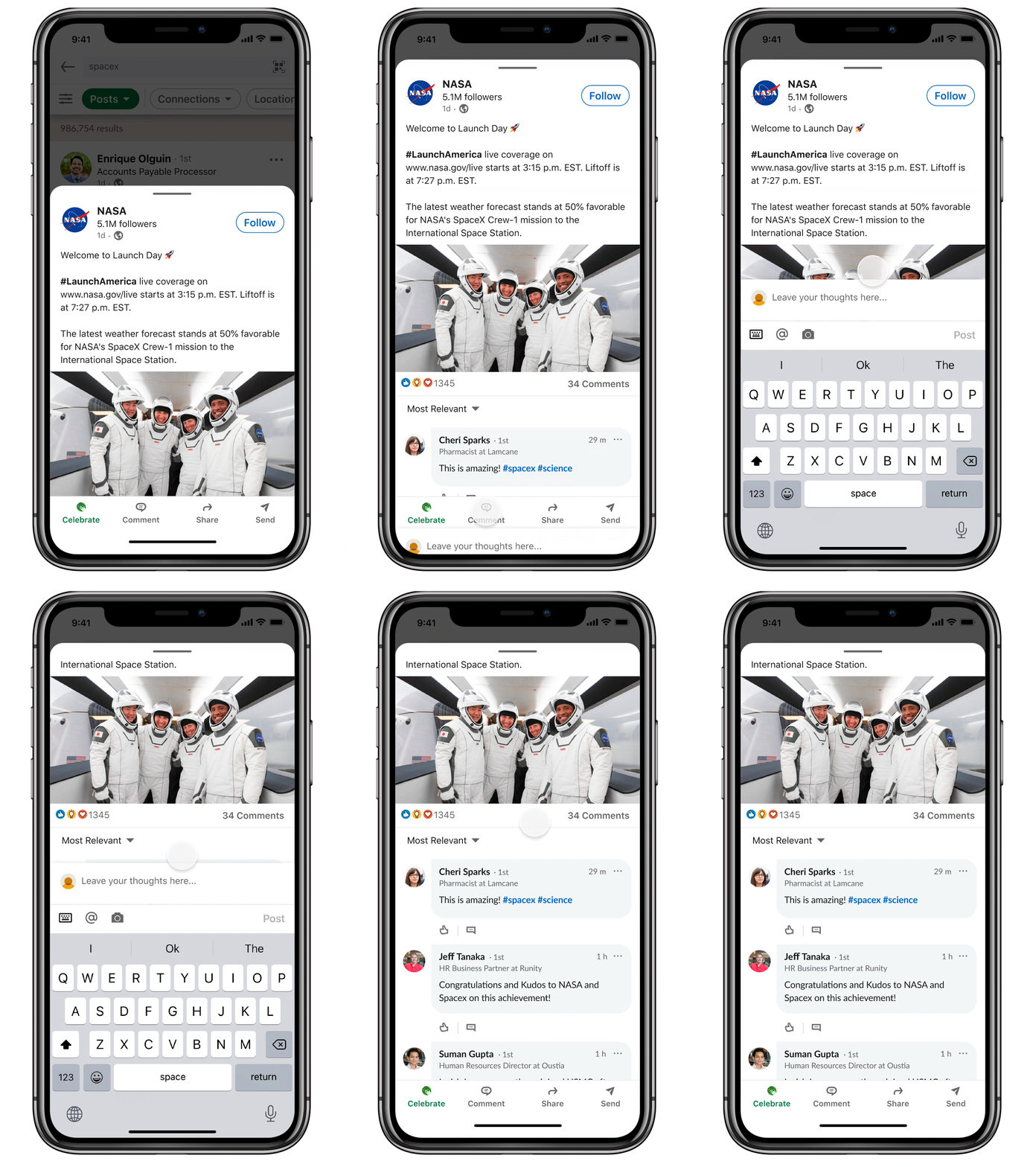
Grow bottom sheet height to enable in-context commenting
I designed the bottom sheet to vertically grow and have the keyboard slide in from bottom. This way members can comment within the bottom sheet surface, retaining their current context.
To dismiss the keyboard, members can tap outside the input box and can continue seeing the post details in the max height view.
Full page take over for slightly complicated tasks like Share, Send
For sub tasks like sending post to another member in message and sharing post on feed, I decided to do add another layer on top of the bottoms sheet and have full page take over. The reason behind this is because these sub tasks consists of several nested tasks and need a more vertical height to orient the users for what they are sharing. With this pattern I also leveraged the existing pattern of sharing posts from LinkedIn’s feed view.
DESIGN DOCUMENTATION
Communicating designs
There were 3 levels of interfaces that were layered on top of one another. It was important to document this properly and ensure the interactions were clear for implementation purposes.
To learn how above designs translated into web experience and this project’s outcome, please email me at rusheka91@gmail.com


